Typography, One of the Most Important Aspect of Web Design
I say, “your web-design is already half done when you’ve taken care of the Typography.” Typography is such an important aspect of User Interface Designs that it would be total folly to neglect it in the underneaths of font-family, font-size and font-weights.
Recently, I went to a casual gathering of WordPress enthusiasts to mark the 10th anniversary of WordPress, and we got talking about themes, plugins, frameworks and overalls of web designs. Amongst the interesting talks on WordPress specific frameworks, themes and general User Interface Frameworks like Bootstrap, Foundation, et al, we also happened to talked about Typography.
Unfortunately, many were not really concerned about it but curious enough that they wanted to know more. This article is the result of that conversation, hoping that other designers would be able to kick-start on the ideas of Typography - explore it and even master it.

I’m not a Typography expert but I’ve a keen interest and always wanted to know more, learn the tactics of using it effectively to make User Interfaces that are easier and better for users. You do not have to be an expert in Typography to make good use of it in your web design works.
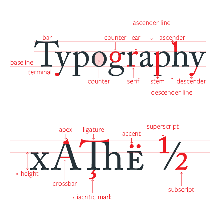
So, here is a basic foundation on Typography that should help you get started. Instead of doing a broad generalization - kerning, leading, letter-spacing, color and fonts - let me get straight to the basics with references a very good Typography Starter Kit - Typeplate.
Typeplate is a “typographic starter kit”. It does not make aesthetic design choices, but define proper markup with extensible styling for common typographic patterns. A stripped-down Sass library concerned with the appropriate technical implementation of design patterns - not how they look.
Besides the original Sass version, it’s also ported to LESS and Stylus, complete with the raw CSS version. You can use Typeplate along with your favorite style frameworks.
If you’re already using a CSS Preprocessor (Sass, LESS, Stylus), you should feel right at home and you can start tweaking the variables/settings to choose the font-size, line-height, etc.
Base
Typeplate uses Modular-Scale to calculate and establish a Typographic scale early on. The font-sizes are established and you’re advised not to pick random font-sizes anywhere in your design. Font-size should be a relative value to either your root default or it’s parent element. Remember to maintain a type hierarchy that is harmonious and consistent.
Word-wrap, Indentation and Hyphens
Typeplate comes with word-wrap, indentation and hyphen taken care of.
By default, unbreakable words may be broken at arbitrary points if there are no otherwise acceptable break points in the line. However, you may choose to have lines break only at normal word break points.
There is a default indentation with Typeplate, of which I’m not overly fond of. Yes, historically we were taught about indentation as a starting point for a paragraph but the web have evolved away from that. Well, you can just turn that off in the Sass settings.
With Responsive Web Design these days, it makes even more sense to have your type more flexible. “In a fluid layout, browser width and typographic measure are linked: the wider the viewport, the more characters per line.”
Since hyphens is an inherited property, it isn’t sufficient to set it for a limited number of elements and assume you’re done. You have to make sure you’ve turned it off for the elements that shouldn’t be hyphenated. – Eric Meyer
Code Blocks
How can a typography kit be complete without a code block style. Typeplate uses Monospace fonts (or “fixed pitch” fonts, contain characters that all have the same character width) for code blocks. 'l', '1' and 'i' are easily distinguished with monospace, '0', 'o' and 'O' are easily distinguished and clear punctuation characters, especially braces, parenthesis and brackets.
Figures
Typeplate takes care of the figure element introduced in HTML5. Figure represents a unit of content, optionally with a caption, that is self-contained, that is typically referenced as a single unit from the main flow of the document, and that can be moved away from the main flow of the document without affecting the document’s meaning. It is very effectively used with an image and a caption.
Block Quotes & Pull Quotes
We all love block quotes and Typeplate have a starting style for it, along with the style for the citation. You can extend it and style it to your choice of design.
It is interesting that Typeplate has a built-in style for Pull Quotes. Pull Quotes are nice but one should be careful that if not styled correctly, it can affect the design of the nearby elements.
Footnotes
Footnotes are a nice way to give references to your articles, content or blog posts. Typeplate has a footnote style ready to be used.
More Typography
Go ahead and explore Typeplate, download or clone the source and study it. It has a pretty small footprint and it gives you a perfect foundation for your types and fonts. Typeplate has other typography elements, such as - Small Capitals, Drop Capitals, Small Print, Definition List and even take special care of Ampersands.